How to Choose Wedding Invitation Fonts: Pairing, Readability, and Style
How to choose wedding invitation fonts: serif, script, and sans pairings, readability rules, and styles by wedding type, with 2026 trends.

by Sarah Glasbergen on 26 June 2026
Web editor
The safest wedding invitation typography uses two fonts: one expressive font for the couple's names and one clean, readable font for the details. Pair by contrast, usually a script or high-contrast serif with a simple sans. Keep essential information at a readable size, avoid pairing two scripts, and the 2026 trend leans toward restraint over heavy flourish.
Fonts set the tone of your invitation before a guest reads a single word. A flowing script signals romance, a crisp sans signals modern, a stately serif signals formal. Get the pairing and the sizing right and the whole suite feels intentional. Below, ThePerfectWedding.com covers the font categories, how to pair them, what suits each wedding style, and the readability rules that keep a beautiful card legible. For where these fonts land, start on our wedding invitations hub.
Key Facts at a Glance
- Most invitations use two fonts, one expressive for names and one neutral for details, with three as the maximum (Source: Bliss & Bone, 2026)
- Essential information needs a readable 9 to 12pt size, while scripts need around 14pt or larger to stay legible (Source: Paperlust, 2026)
- Pairing two script fonts is the most common typography mistake and almost always reads as cluttered (Source: Letterhanna, 2026)
- The 2026 shift is toward intentional restraint, single-weight scripts and high-contrast serif plus neutral sans pairings (Source: Paperlust, 2026)
- Foil and letterpress need bolder stroke weights, because hairline strokes can break during pressing (Source: Paperlust, 2026)
What Are the Four Font Categories?
Almost every wedding font falls into one of four families, and knowing them makes pairing far easier. Each one carries a different tone, and most invitations combine two of them for contrast.
- Serif: small finishing strokes at the ends of letters, like Garamond or Playfair Display. Reads traditional, formal, and considered, and handles small detail text well.
- Sans serif: clean letters with no feet, like Montserrat or Inter. Reads modern and editorial, and keeps fine print effortlessly legible.
- Script: flowing, handwriting-inspired letters, from formal calligraphy to loose brush styles. Almost always used for the couple's names.
- Display: decorative, high-impact letterforms for headlines only. Striking in large sizes, but rarely used for body text.
How Many Fonts Should You Use?
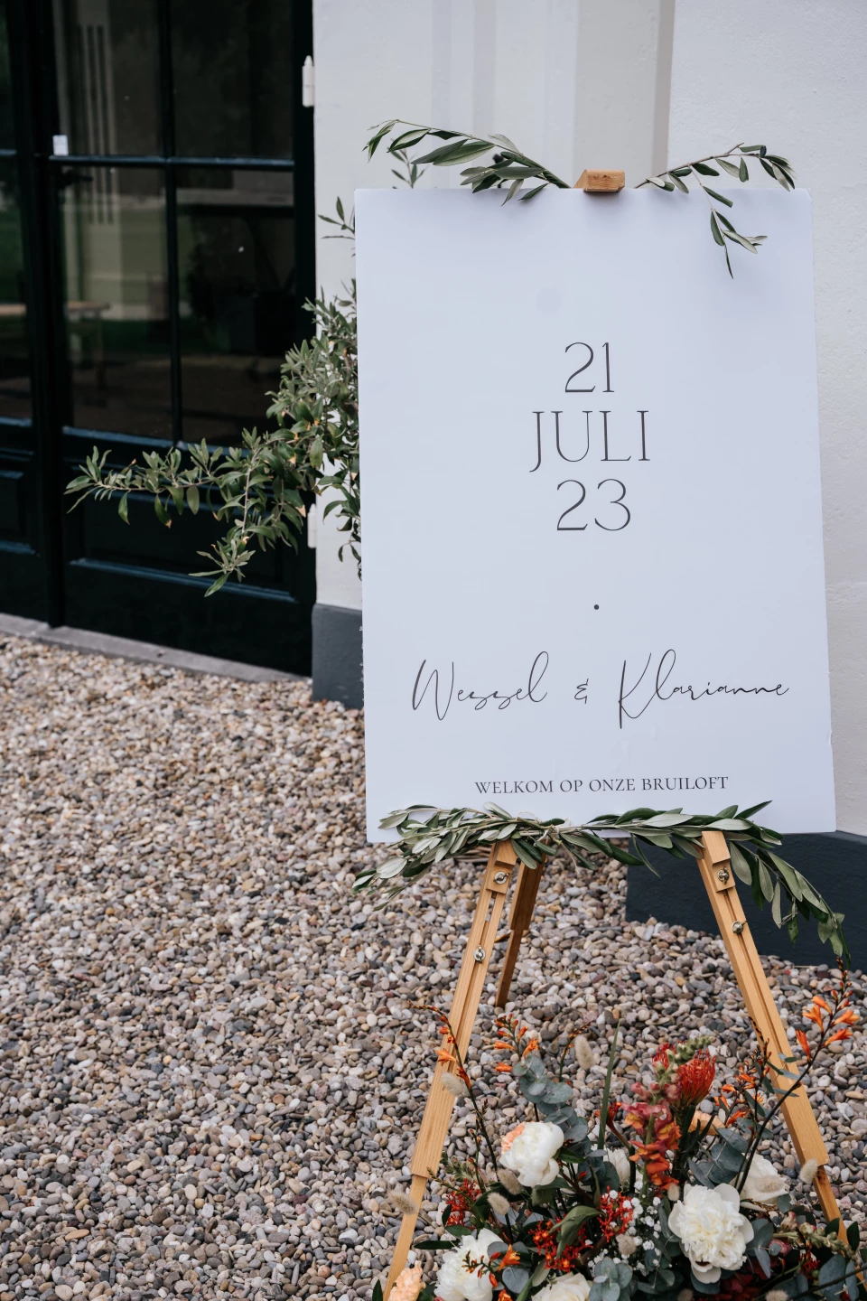
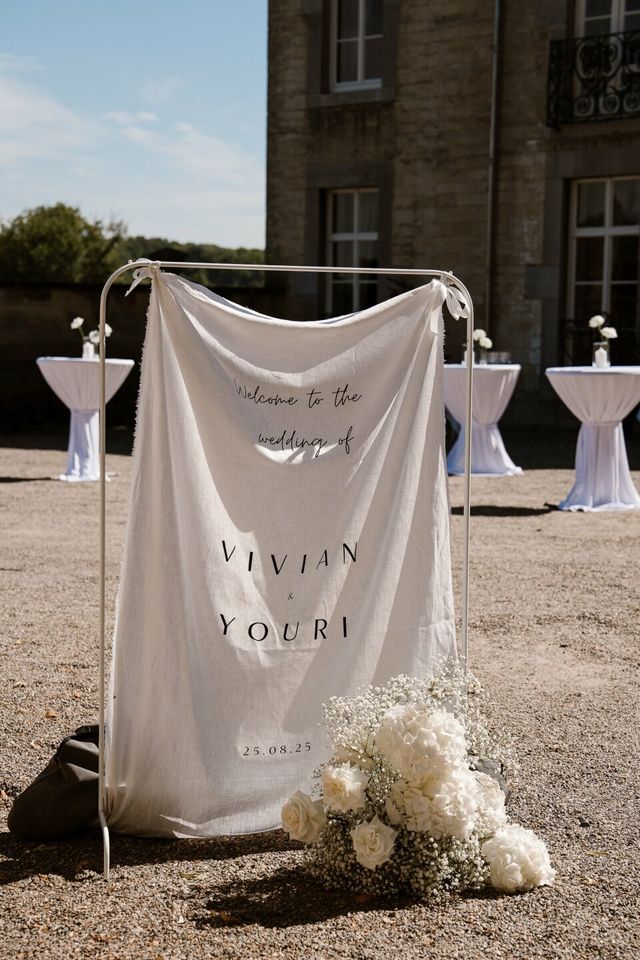
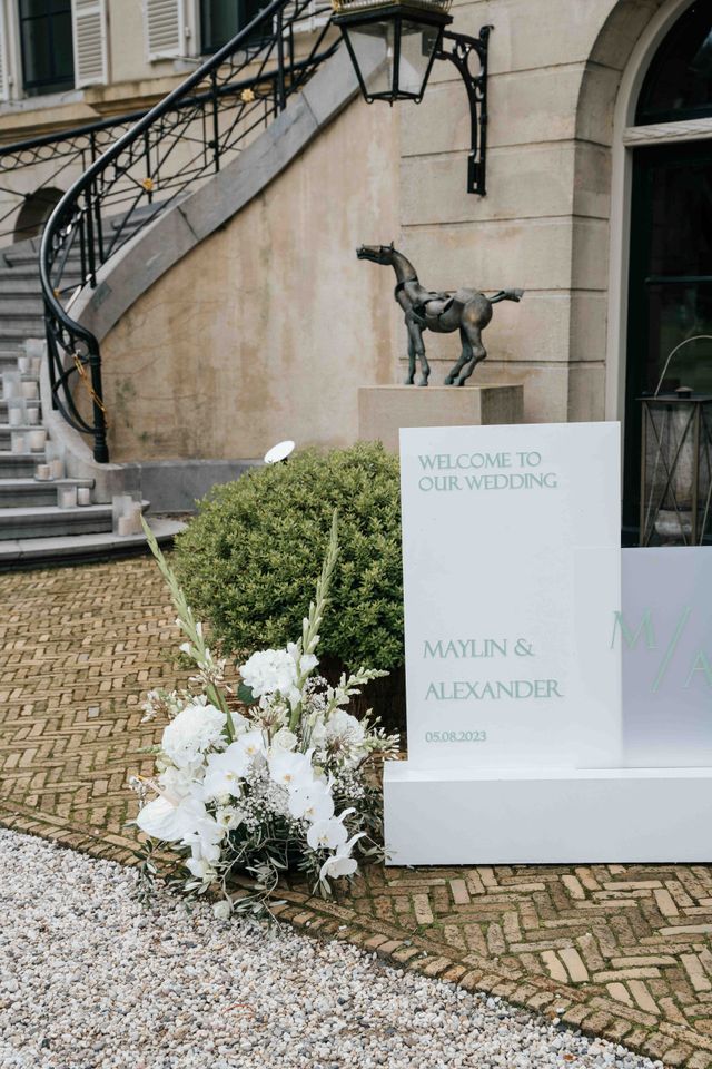
Two is the reliable answer. One expressive font carries the names and headline moments, and one neutral font carries everything else: the date, the venue, the address, the fine print. A third font can appear as an accent, often the italic of a font already in the design, but more than three competing styles makes a card feel busy.
The discipline here is the same one that makes a ceremony program or a menu read cleanly: let one font lead and the other support. Use the same two fonts across the whole suite and into your reception stationery, and the entire wedding looks designed by one hand.
How Do You Pair Fonts?
Pair by contrast. Fonts that differ clearly in category but share a compatible mood create hierarchy that the eye reads instantly. A script paired with a serif reads classic and romantic. A sans paired with a script reads modern and personal. A high-contrast serif paired with a neutral sans reads editorial and fashion-forward.
The pairing to avoid is two scripts together, which almost always looks cluttered and hurts readability. If you want more than one expressive moment, use a single script in two different sizes rather than two different scripts. Let the expressive font own the names, and let the neutral font own all the information guests actually need to read. A low-risk way to add a third layer of hierarchy is the italic of a font already in your design, used for small accent phrases like the word 'and' or 'reception to follow,' which introduces variety without bringing in a whole new typeface.
What Fonts Suit Your Wedding Style?
Type should match the wedding. A useful test: imagine the font on your venue's sign. If it feels out of place there, it will feel out of place on the invitation. The table below maps common wedding styles to a primary font for names and a supporting font for details.
| Wedding style | Primary (names) | Supporting (details) |
|---|---|---|
| Formal, black-tie | Classic serif or calligraphy | Refined serif |
| Modern, minimalist | Geometric sans serif | Same sans, second weight |
| Romantic, botanical | Flowing script | Elegant serif or sans |
| Rustic, garden | Relaxed handwritten script | Lightweight sans serif |
| Vintage, art deco | Display or titling serif | Geometric sans serif |
Carry whichever pairing you choose through every piece, from the invitation to the seating chart and the table setting signage. Consistency is what turns individual pretty cards into a cohesive look.

What Are the Readability Rules?
A gorgeous font fails if guests cannot read the date. Any font carrying essential information, the date, time, address, and reply instructions, needs to be a clean, readable face at 9 to 12pt. Scripts need more room, around 14pt or larger, because thin connecting strokes blur at small sizes. Names and headline text can go much larger.
Always proof at actual print size, not zoomed in on a screen. What looks elegant at 200% on a monitor can turn into an unreadable smear at the real 10pt of a venue address. Give the type breathing room with generous spacing, and keep strong contrast between the text and its background so nothing disappears. If you are unsure, print one test card and read it at arm's length in normal light, the way a guest actually will.
What Are the Current Font Trends?
The clearest shift is toward intentional restraint. After several years of maximalist swash scripts and heavy flourish, couples and designers are returning to cleaner, more considered pairings. Single-weight calligraphic scripts, with consistent stroke width rather than dramatic thick-to-thin contrast, feel modern while keeping a handcrafted quality.
The other rising pairing is a dramatic high-contrast serif, such as Didot or Bodoni, with a simple sans for the details, which reads editorial and fashion-forward. Dramatic initial caps and oversized names create hierarchy through scale rather than through extra fonts. Couples are also pairing type with more adventurous color, moving beyond black on white toward deep jewel tones, soft unexpected pastels, and earthy palettes that make the lettering feel current. These directions sit comfortably alongside the broader palettes you can explore across our wedding invitations hub.
How Do Fonts Affect Printing?
Type and print method interact. Foil stamping and letterpress press into or onto the paper, so hairline strokes below about half a point can fill in or break during pressing. Scripts and delicate serifs need slightly bolder weights for those methods than they would for flat digital print. Confirm this with your stationer, and see how the methods differ in our wedding invitations hub examples.
Ask your designer for a proof on your actual paper and print method before approving. A font that looks crisp in a digital mockup can behave differently pressed into cotton stock. Find a stationer who proofs properly in our invitation vendor directory.
“The most elegant invitations I see almost always use just two fonts. One beautiful script or serif for the names, one quiet workhorse for everything else. Couples get into trouble when they fall in love with three or four fonts and try to use them all. Restraint reads as expensive. Clutter reads as homemade.”
Sarah Glasbergen, Senior Wedding Editor at ThePerfectWedding.com [DRAFT QUOTE: needs approval]
-
How many fonts should a wedding invitation use?
Two is ideal: one expressive font for the names and one clean font for the details. A third can appear as a small accent, often an italic of a font already in use, but more than three looks busy.
-
What fonts are best for a formal wedding?
Classic high-contrast serifs like Didot, Bodoni, or Garamond, or a traditional calligraphic script for the names, supported by a refined serif for the details. Avoid casual handwritten styles.
-
Can I pair two script fonts?
It is best avoided. Two scripts together almost always look cluttered and hurt readability. If you want more than one script moment, use the same script in two sizes instead.
-
What size should invitation text be?
Essential details should sit at a readable 9 to 12pt. Scripts need around 14pt or larger to stay legible, and names can be much bigger. Always proof at real print size.
-
What are the wedding font trends for 2026?
Restraint is the theme: single-weight scripts with even stroke width, and high-contrast serif paired with a neutral sans. Hierarchy comes from scale and bold names rather than from extra fonts.
-
Do fonts need to change for foil or letterpress?
Slightly. Pressed methods can break very thin strokes, so scripts and delicate serifs need bolder weights for foil and letterpress than for flat digital printing.
Style Your Invitations with ThePerfectWedding.com
Browse designs on our wedding invitations hub, get the wording right with our invitation wording guide, carry your fonts through to your seating chart and table setting, and find a stationer in our invitation vendor directory.


